


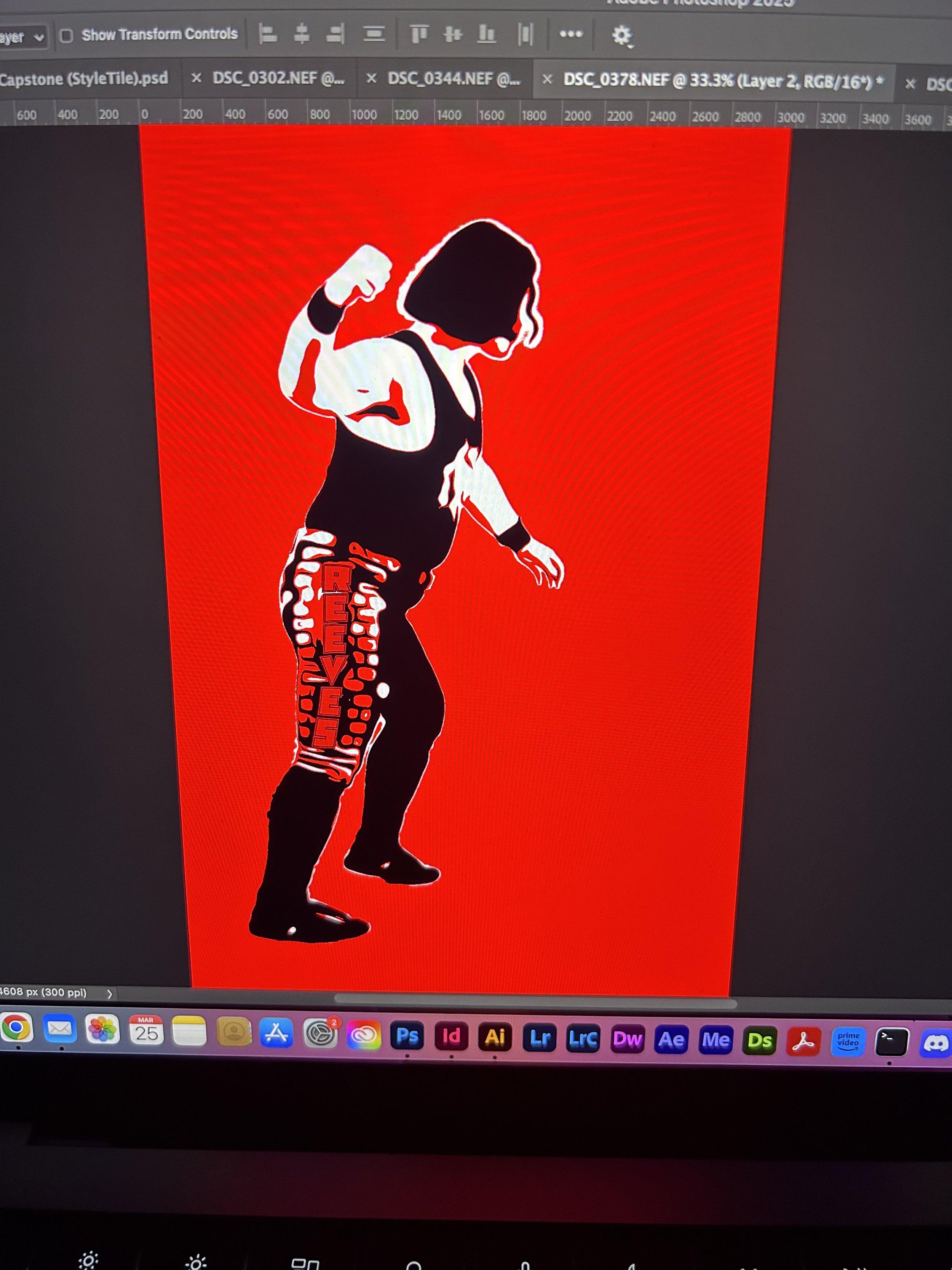
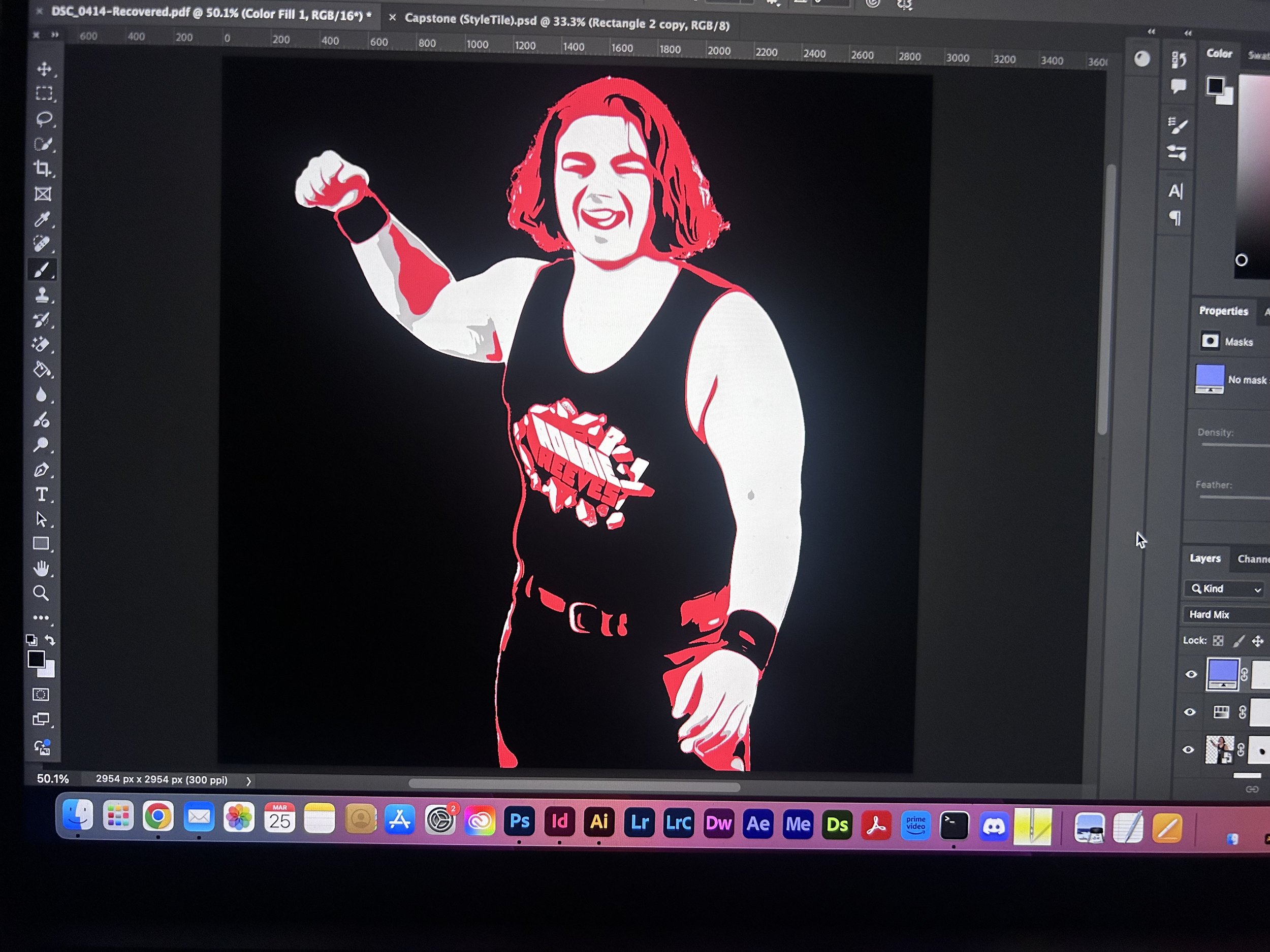
Created a bold, stylized t-shirt graphic for independent wrestler Robbie Reeves. The design uses limited colors, comic-inspired illustration, and playful repetition to capture his charisma and signature “Brick by Brick” catchphrase.
Design Objectives:
Translate wrestler’s persona into a wearable, fan-friendly graphic.
Emphasize the “Brick by Brick” theme with visual metaphors.
Use red, black, and white for maximum contrast and screen-print clarity.
Incorporate expressive poses to highlight personality.
Create a design that works on both merch and promotional materials.
Maintain bold readability and impact from a distance.


Design Process
The concept was built around the idea of an illustrative, wrestling-inspired college tee. We drew inspiration from the Danny Duncan brand, adapting its playful, rebellious style into a more rugged, wrestling-centric aesthetic. From sketch to final design, the focus was on creating something that felt iconic and fan-driven—something you’d want to wear ringside or out in the wild.

top 3 designs


